
How to choose the right watercolor paper
If you are starting to paint with watercolors maybe you are wondering how to choose the right watercolor paper. From the main watercolor supplies -paint, brushes and paper – I think this last one is the most important factor to achieve a good result. Trying to paint on a paper that was not made for watercolors can get really tricky and you will probably end up frustrated – if you ever painted on a typical computer paper you know what I’m talking about.
Let’s dive in the different aspects to find a good quality watercolor paper: weight, texture, quality, and format and then I will tell you a bit of my experience with some watercolor paper brands.

WEIGHT
If you don’t have the time or the patience to learn each of this technical characteristics, the most important thing that I would say that you should look for is a good weight paper.
The weight indicates how thick the paper is. When painting with watercolors we use water together with the paint. If you are not using a paper that supports the amount of water you are using it will buckle.
- LIGHT – 180 g/m2
- MEDIUM – 300 g/m2
- HEAVY – 640 g/m2
I started painting on a 180 g/m2 paper, and I can say that it really made the difference when switching to a 300 g/m2 paper.
My illustrations are usually a small object centered in the paper so a Medium weight paper is all I need.

If you plan to make big washes and cover a big part of the paper with paint, then I suggest that you choose a Medium to Heavy weight paper.
If you are starting, and for example you are printing the Coloring Book for practice, you can use a 180 g/m2 paper as it is normally cheaper and then improve to a medium weight paper.

TEXTURE
There are 3 watercolor paper textures: hot press, cold press and rough. This is given by the way the paper was produced and finished.
- HOT PRESS – Smooth texture
- COLD PRESS – Semi – rough texture
- ROUGH – well, the name says it all.
So this texture will define some properties of your final piece of art.
- OVERALL LOOK – Of course there is the overall look of the paper.
- WATER RETENTION – On a smoother paper (hot press) the water will slip easily. This means that is not so easy to control it. On a rougher paper the water is absorbed easily so you don’t have much time to move the paint around before the pigments are set to it.
- BRIGHTNESS- The rougher it gets, the duller it gets. So on hot press paper you will get the brighter and most vivid results and in rough paper the pigments seem to be dull.
You will need to experiment to see which kind of paper will adapt better to your style.
My personal choice is almost always cold press paper. This paper texture is kind of in the middle point: not too smooth – not too rough. For this matter it is the most commonly used paper by watercolor artists. Anyway, between the cold press paper brands I find that there are some little variations to the smoother or rougher side. If you are really used to one kind of paper you will feel the difference.
QUALITY
Studio paper or Professional paper? This one is easy to understand. If you plan to sell your art you will probably like to use a professional paper – if you are doing art to scan and sell digitally you can decide which one to use.
This are the main points regarding quality of watercolor paper:
- MATERIAL -The best paper is made of cotton. So you need to check the percentage of cotton in it. From 100% cotton, there are some % variants often indicated as 75% cotton, 50% cotton, 25% cotton. The ones made of 0% cotton – Will be made of wood pulp and cellulose.
- ACID FREE - When possible check that the paper you are buying is Acid free and without optical brightness additives. This will prevent your art piece to get yellow with time. Some papers also include a Mould-resistant treatment.
FORMAT
Watercolor papers can be bought in pads, blocks and sheets. I usually buy pads, I think they are less expensive and more comfortable to use.
- PADS - When buying pads, I suggest you check that they are taped on the side and not wire bounded. Unless you plan to leave your art piece on the pad, having the wire make it inconvenient as you will need to resize your piece of art when cutting it off the pad.
- BLOCKS - Blocks are glued down usually on 4 sides. If you are doing big washes it can be useful to use blocks as it won’t buckle as its already taped down. I don’t use blocks because I trace the illustrations first (you can see how I do it HERE) so I need the paper sheet to be detached.
- SHEETS - I only buy sheets when I need to paint a bigger size piece, usually to frame. I buy them specially for each project as they are really difficult to store and they can get dirty or folded- and is really annoying to buy expensive sheets and get them wasted.
WATERCOLOR PAPER BRAND REVIEWS
As I mentioned before I use Cold press paper mainly. So what you will see next are some reviews of some paper brands I regularly use.

Caballito Premium by Canson - 180 g/m2
WEIGHT- Light weight 180 g/m2
TEXTURE - Cold press
QUALITY - 100% cellulose
FORMAT - Pad
REVIEW - I used this one a lot when I started painting, I believe that it is only found in Uruguay. It's a cheap and good enough paper to practice, but is really thin and it buckles easily. It works if you are painting small surfaces with little water. If you are planning to do big washes choose a thicker paper.

MY FAVORITE : Canson Montval - 300 g/m2
WEIGHT - Medium weight 300 g/m2
TEXTURE - Cold press
QUALITY - 100% cellulose
FORMAT - Pad
REVIEW - This is my favorite paper and the one I will recommend to start painting. It's not so expensive, the texture is really good - it's nice for painting and it's also good for drawing with pen. I also erase the pencil trace and it doesn't get damaged. It comes in different sizes and in big packs (I buy the maxi pack with 100 sheets) It runs through the printer easily so I print the Coloring Book pages on this paper.
Be careful when buying this paper as it is easily confused with other weights as the cover design is similar.

Canson Montval - 200 g/m2
WEIGHT - Medium weight 200 g/m2
TEXTURE - Cold press
QUALITY - 100% cellulose
FORMAT - Pad
REVIEW - Similar to the previous one, but thinner. I use this paper when I'm doing small illustrations that will be scanned. Be careful when buying this paper as it is easily confused with other weights as the cover design is similar.

Canson Watercolor Postcards - 300 g/m2
WEIGHT - Medium weight 300 g/m2
TEXTURE - Cold press
QUALITY - 100% cellulose - Montval Paper
FORMAT - Sheets Pack
REVIEW - I find this format very convenient to pack to travel. The individual sheets already on a small size makes it easy to make illustrations when you are not at your studio. On the other side of the paper it has the classic lines and stamp placement the postcards have.

Strathmore Watercolor Postcards - 300 g/m2
WEIGHT - Medium weight 300 g/m2
TEXTURE - Cold press
QUALITY - 100% cellulose
FORMAT - Sheets Pad
REVIEW - Similar to the previous one but on pad format. On the other side of the paper it has the classic lines and stamp placement the postcards have. I'm not a big fan of Strathmore paper, I find it's quality is not so good.

Fabriano - Cold press Studio Watercolor - 300 g/m2
WEIGHT - Medium weight 300 g/m2
TEXTURE - Cold press
QUALITY - 25% Cotton
FORMAT - Pad
REVIEW - I really like the texture of this one. A little rougher texture than the Montval paper.

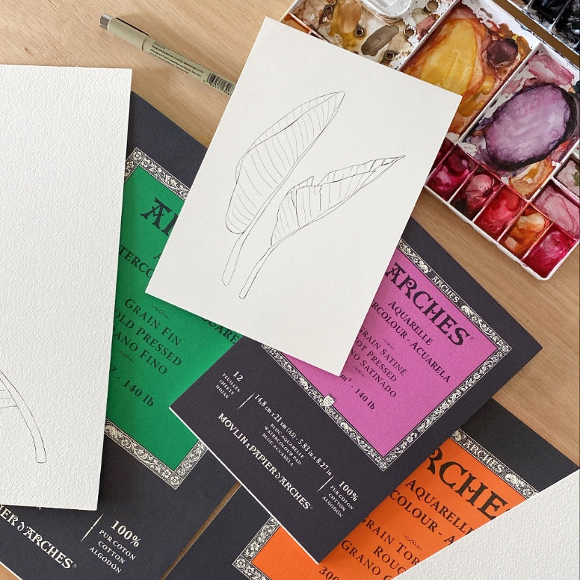
Arches - Cold press - 300 g/m2
WEIGHT - Medium weight 300 g/m2
TEXTURE - Cold press
QUALITY - 100% Cotton
FORMAT - Pad
REVIEW - This one is considered professional paper. Really nice quality, 100% cotton, but it is a bit rough for drawing with pen. I don't use this one so much.

Arches - Rough - 300 g/m2
WEIGHT - Medium weight 300 g/m2
TEXTURE - Rough
QUALITY - 100% Cotton
FORMAT - Pad
REVIEW - This one is even rougher, so it's not so easy to draw with pen on it. I think this kind of paper is not suited for the kind of illustrations I make. It would probably be great to make big abstract paintings. As I explained about the rough texture, water doesn't flow easily.

Hahnemuhle - Veneto Rough - 325 g/m2
WEIGHT - Medium weight 325 g/m2
TEXTURE - Rough
QUALITY - 100% Cotton
FORMAT - Block
REVIEW - This block have their four sides glued down. The quality of the paper is really great but I don't use it that much.

Hope this helps you to find the perfect watercolor paper to suit your style. Don't forget to pin and save this post for future reference ! Let me know if you have any comment or suggestion and share with your fellow watercolor artists.